In this post, we explore past technology and UI design from a QA tester and user perspective. We look at interactions and accessibility, discover why older devices were designed in specific ways, and ask how today's QA tester can assess retro UI design and its influence on modern design.
In this post, we explore past technology and UI design from a QA tester and user perspective. We look at interactions and accessibility, discover why older devices were designed in specific ways, and ask how today’s QA tester can assess retro UI design and its influence on modern design.

Digital design has come a long way in the past 30 years. The invention of the microchip in the late ’50s and the minification of parts enabled considerable leaps in technology and advances in the way we interact with our products. With electronics and devices becoming ever smaller, faster, and more powerful, it is easy to forget about the history and legacy of the equipment we take for granted every day. We might assume that technological improvement is continuous, from the physical build to the interface and UI design and the way we interact with them, but this is not necessarily true. So it can be a good idea to reflect on where we have come from occasionally and look back to consider how we got to where we are today. Doing this can help us understand if there is anything we can learn from the now obsolete retro technology from our childhood and previous generations, as well as consider how, and if modern replicas successfully deliver.
Mental Models
Before there were GUIs (graphical user interfaces), operators of early electronic devices had to push buttons and switches, turn dials, load data discs, and tapes, and type in text-based instructions to carry out their operations.
As technology became more sophisticated, and machines transformed from needing levers and pulleys, and manually operated cranks gave way to motherboards and data storage discs, the inner workings of computers were regarded as something of a mystery because we could no longer see the functional operating parts. Workings were now thought of as abstract and intangible, so without any real way to visualize, people started to create mental models as ways to understand the goings-on inside the box. These models were confusing and notoriously complex to understand if you did not work in computers, mathematics, or engineering.
Concepts like bytes of data, storing and accessing files, carrying out operations, and creating programs by inputting lines of code, seemed like another world to most people. Computers seemed lightyears away from being accessible to the typical workforce, let alone the everyday public.
Famously, in 1977, Ken Olsen, the founder and CEO of Digital Equipment Corporation, said, “There is no reason for any individual to have a computer in his home.”
The Original Graphical User Interface
By the time it was accepted that computers were the exclusive domain of technicians and engineers, a development came along in 1973 that changed the way we would interact with electronic devices forever. Researchers at the Xerox Palo Alto Research Centre (PARC) developed a personal computer with the first modern graphical user interface, the Xerox Alto. Although it was not a commercial product designed for public use, intended mainly for research at universities, it revolutionized the way we thought of computers and smashed down barriers between humans and machines.
The Desktop
The Alto is cited as the first computer to introduce the UI concept of the ‘desktop.’ This approach worked as a metaphor to transform abstract files and bits of data stored on hard disks that whizz through circuit boards, into something that people could understand and relate to as physical. Being able to do this was important because it gave people something tangible to hook onto that was already recognized as physical. It was now possible to “see” a file within the context of everything else stored on the computer. This innovation gave people a better grasp of the hierarchy and relationships between files and the folders in which they were stored. We could also now better organize and manage our digital work, setting the path for the next few decades.
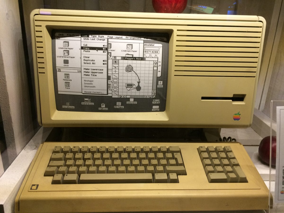
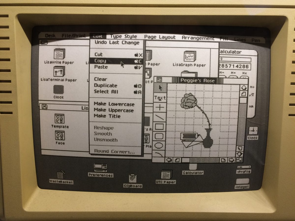
An early Apple Macintosh complete with a graphical user interface.
Xerox continued to innovate, and Steve Jobs was said to be incredibly influenced by their developments. He apparently ‘borrowed’ a number of Xerox innovations when creating the Apple Lisa, and eventually, Apple’s original 1984 Mac OS would go on to popularise the desktop metaphor in personal computing.
With additional concepts such as a ‘wastebasket’ and ‘clipboard,’ again taken directly from real life ways of working at the time, the UI provided users with something familiar. It allowed them to carry out activities without needing to work through complicated written commands or push buttons at one end of the machine to wait for the outcome at the other. The term WYSIWYG, which stands for “what you see is what you get,” was coined for just that reason.
Whenever we design an interface, and QA tests our products, we need to understand that people’s mindsets are still rooted in the physical world. If we can create digital experiences that reflect their reality as much as possible, while reducing the abstract where we can, the user will have a fuller, more understandable, and relatable experience. People are generally more tech-savvy these days but still aim to reference real-life objects and concepts where appropriate.
- Remove as many barriers as possible between the user and the outcome – the interface should be as transparent as possible
- Ensure the output is linked directly to the input, and in the same place, feedback to the user as soon as an action is made
Simplicity and Sophistication
While we have discussed the desktop and on-screen UI, it is still important to understand the physical aspect of design because some of the theories and best practices from the real world can be translated directly into the digital.
When you think of a phone, the picture in your head is probably of a modern cell phone, either Android or Apple. The modern cell phone is undoubtedly an incredible piece of technology, but how did we get here and what user interface challenges were faced, and discoveries made along the way?
One of the very first cellular phones was the Motorola DynaTAC Analog AMPS. Unlike its static predecessors with a rotary dial, this phone had chunky buttons that could quickly call a number. It had a small LED screen showing the digits you were dialing, giving immediate feedback to your actions.
The design of the physical buttons is important here. They must be small enough to make the phone relatively compact and portable, but large enough for manual interaction while on the go. The spaces between the buttons are designed with small indentations around them so that users don’t accidentally misdial by pressing the wrong button.
Remember I earlier mentioned mental models? Well, can you recall trying to type a text message on an old Nokia 3310 before predictive text had been invented? There were no full touch screen keyboards back then; instead, you had to tap the numbers several times to cycle through letters to be able to construct your message, and you would have had to create and store that mental model in your head. For example, if you wanted to write the letter S, you would have had to remember that tapping the number 7 three times would give your chosen letter.
- Design the UI, keeping the context of the user in mind – and place the buttons where they expect to find them
- Ensure your UI buttons are large enough to be accessible
- Reduce the cognitive load as much as possible by removing complexities
- Use color on interface items to signify key actions
- Consider the hierarchy of importance – position the most used UI elements at the top, or where the user can access them most easily
Icon Design and Visuals
I look back fondly at early icon design from years gone by and often marvel at just how good the interface designs were, given their limitations. As a graphic designer myself, I was influenced and had my future-career shaped by admiring my old Amiga 500 computer and the cutting-edge graphics of the time.
It is still best practice to follow the design ethos of these original icons from 30+ years ago:
- Single color icons are easy to understand
- Ensure visible contrast between the icon and background elements
- Keep the design simple, and avoid decoration when communicating function
- Always include a label, in case the icon isn’t clear
Skeuomorphism
As technology continued to progress and screen resolution, pixel density, and screen colors increased, there came the opportunity to create more realistic looking icons, which enabled skeuomorphism, a huge design trend that peaked in around 2010. If you are unfamiliar with the name, you will undoubtedly have seen examples and know what it means. Skeuomorphism is the name of a design style that seeks to imitate real-life objects by replicating textures, materials, and faux-3D depth to give the impression of tactility on an otherwise flat object. Apple’s iOS adopted skeuomorphism in earnest with the iPhone during 2007. They popularised the style, and it was then adopted by most competitor cell phone UIs, computer operating systems, and many websites too.
While some icons and interface designs of this era look truly gorgeous, the products of evident craftsmanship with tremendous skill, critics of the trend say they are less accessible than a more basic interface. This is because they can confuse the user about what is interactive and what is decorative, which can increase the cognitive load on users. After all, there are more elements to decipher and figure out visually.
While we can understand the thinking behind skeuomorphism (the desire to emulate existing ‘real world’ items to bridge the gap between physical and digital), some might argue that it went too far. This is evidenced by the design trend that immediately followed skeuomorphism, which stripped away all embellishments to get back to basics.
- Use real-life visual prompts to create a cognitive anchor in people’s minds without the need for thinking – use tropes like trash cans when talking about deleting things
- Use depth, shadows, and textures to indicate that physical actions are required, such as clicking and dragging
- Find the right balance between decoration and instructional design
Flat Design
This design trend has its roots in 1920s graphic design in Europe, often known as Swiss design. It is characterized by using simple, bold shapes, limited colors, and often thick, chunky lines and sans serif fonts. The term ‘flat’ refers to the avoidance of gradients, textures, or drop shadows, overused in the previously mentioned design trend.
This flat style is more akin to the retro design UIs mentioned earlier in this article, but with one key difference. The designers of these interfaces can do more, but flat design and the future variants that evolved from it, are designed with constraint in mind. Flat design and classic user interfaces are limited in terms of decoration, so it is important to remain aware of the following points when designing any piece of interactive – your design needs to succeed in communicating an idea, action, or message. Use any design style you feel is appropriate, but don’t obscure that message with frivolous design or visual noise.
- Focus on one important aspect of an icon; represent the single key action and don’t confuse
- Ensure the icon can work well at small-scale and at a glance
- If the icon is not 100% clear, include a descriptive label for the action performed
Summary
As technology continues to evolve and devices become more advanced, it’s essential to take stock and look back on how we arrived at where we are today. Put yourself in the shoes of those early developers and QA testers. They pushed the boundaries in technology that we now look back on with nostalgia.
Trends may come and go, but design principles and testing practices last forever.